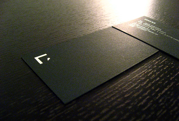
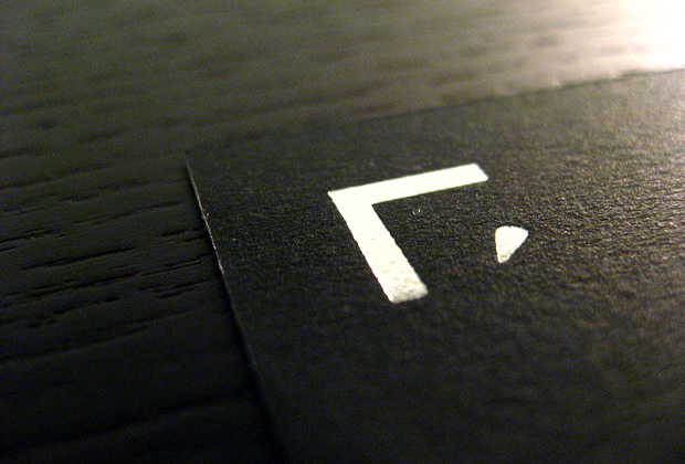
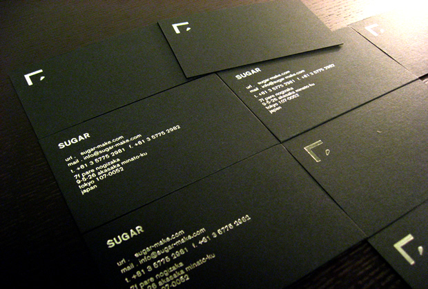
SUGAR™ visual identity
brand card
........
brand direction : mayuka sano ( SUGAR )
visual identity : tomomichi ikeda ( ungraffi )
art direction + graphic design : tomomichi ikeda ( ungraffi )
print : csm Inc
thanks , masanori aoki ( csm Inc )
paper : DM 450kg ( beaten silver )
......
logo design concept
The logo symbol symbolizes that is the company where sugar Co., Ltd. promotes [beauty] as shape; is done.
I expressed "unity" (balance) or "sense of stability" "trust" "universality" by making a feeling of total unification the square of the square and decided to be based on this. "," of the lower right becomes the a cute accent symbolizing the beauty of the woman. For example, there is difference in this the a cute accent between English and French, and the English as the sight thinks that French can feel a significant, sexy impression for making masculine vanity because I spell it, and a character sign enters. This as a symbol of the beauty on the left there "is a meaning of ideal the shape protects the beauty, and to improve".
I will design the logo symbol which is easy to have I am solid-looking and I am symbolic and recognize it wearing well in future when I aim at the wide development about the field of beauty not to lose a high class and a feeling of brand.
posted by tomo | date: December 7, 2009 11:07 AM