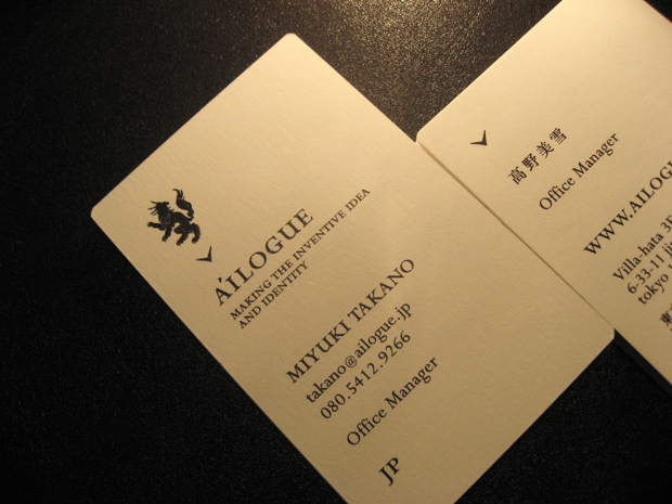
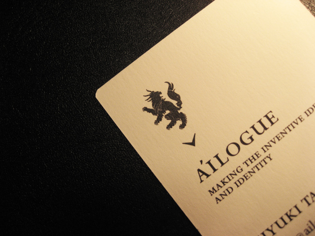
A'ILOGUE™ visual identity
lbusiness card design
........
parent organization : puneet talwer ( AYD Inc. NYC )
visual identity : tomomichi ikeda ( ungraffi )
art direction + graphic design : tomomichi ikeda ( ungraffi )
print : graphic print
paper : Vent Nouveau white 230kg
......
About the logo symbol,
It symbolizes our new business development and is meant to be the identity for ailogue. It symbolizes Japanese history and elegance. Whole silhouette represent flame, head dragon, body lion and wolf tail.
This symbolizes the richness of our various values. It also means that the animal is kinetic, strong and well balanced.
The name of the symbol is “agile”.
posted by tomo | date: November 2, 2010 10:29 PM