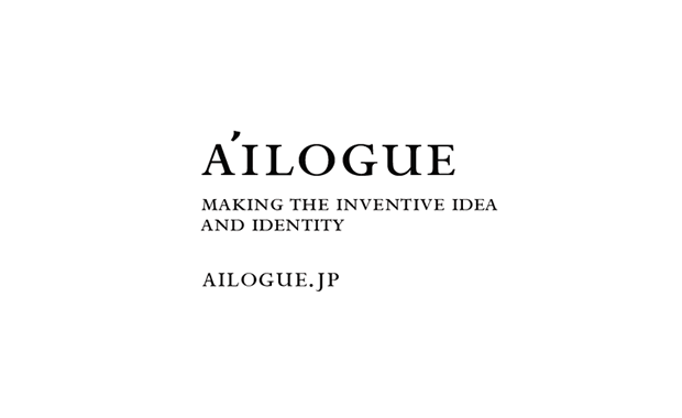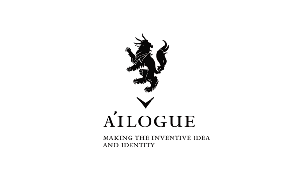


A'ILOGUE™ visual identity
logo design + conceptwork
........
parent organization : puneet talwer ( AYD Inc. NYC )
visual identity : tomomichi ikeda ( ungraffi )
art direction + graphic design : tomomichi ikeda ( ungraffi )
project management : miyuki takano ( a'ilogue )
logotype base : Perpetua SC
symbol name : - agile -
......
Firstly, as an origin of the company name, ay digital sets up its East Asian foothold neither in Soul, Korea,
nor in Shanghai, China, but in Tokyo, Japan. This may indicates that we want to emphasis on our high quality work unique to Japan as ay digital’s corporate brand image.
we want to express that this Japan based Tokyo office is a team with Japanese high quality.
Like Lexus for Toyota, Apple for Macintosh, SAS (Special Air Service) for British armed forces, there are many brands and organizations that are known independently for their best performance. This company name represents my wish that Tokyo office for ay digital inc. will be known as the best team in such meaning.
concept by tomomichi ikeda ( ungraffi )
posted by tomo | date: November 9, 2010 11:45 PM