works - logo+graphic archives


August 23, 2011

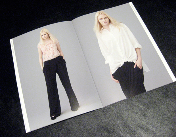
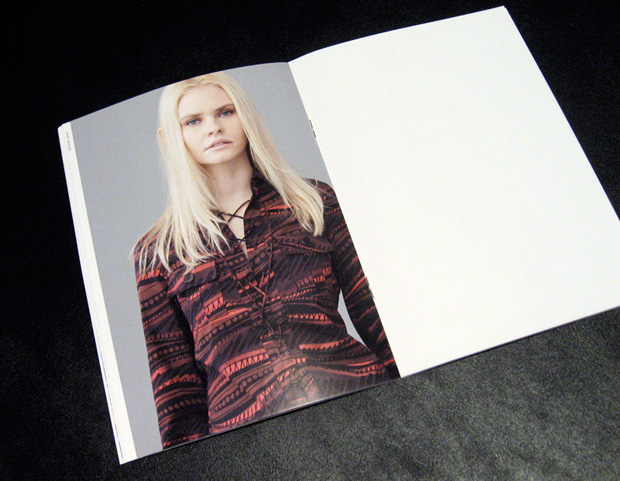
ACQUA GRAZIE : art direction

acquagrazie001.jpg

acquagrazie002.jpg

acquagrazie003.jpg

acquagrazie004.jpg

acquagrazie005.jpg

acquagrazie006.jpg

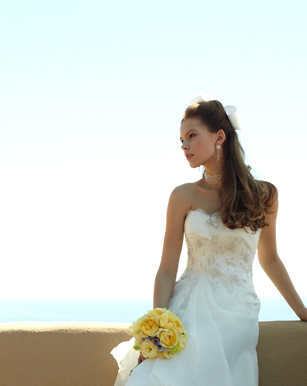
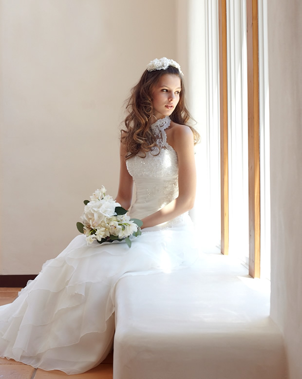
ACQUA GRAZIE - Elegant as aqua, rebirth into every figure -

.....

brand direction : tadashi sato, midori onikuma, maki okabe ( ACQUA GRAZIE )
creative direction : paragraph
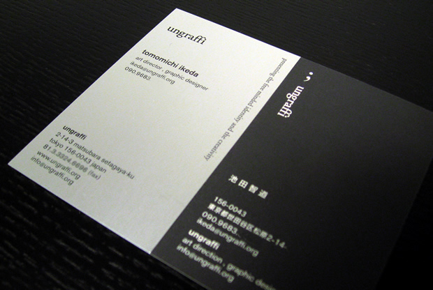
art direction : tomomichi ikeda ( ungraffi ), kenji koga, kayo takamatsu ( evidence )
photography : kio yoneda ( cube management )
hair make : natsuka ( a.k.a management )
coordination : condition green
location : copntrail
model : nastia ( surge ) _portfolio
location : art grace wedding chateaux
.....

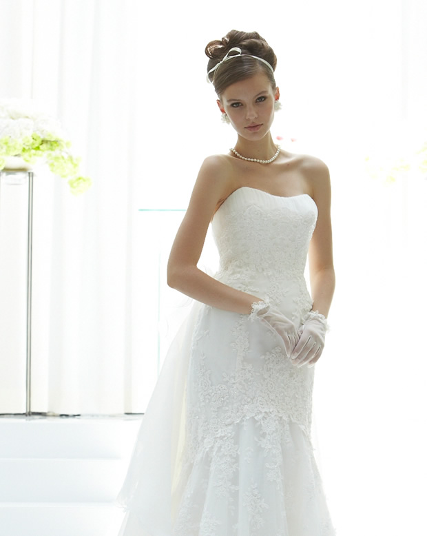
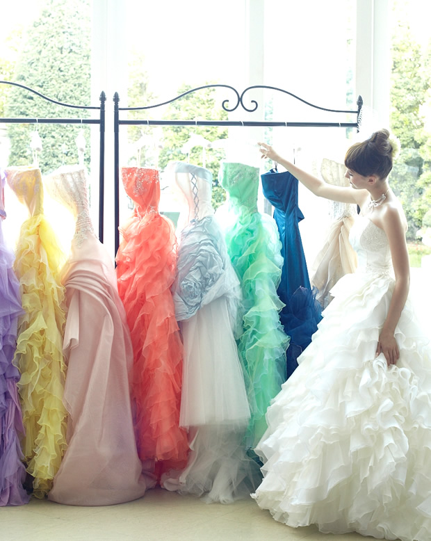
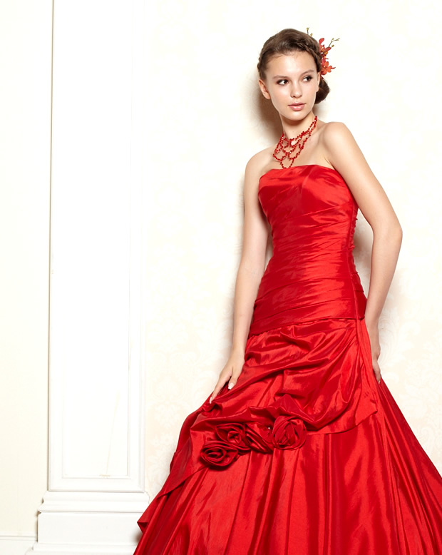
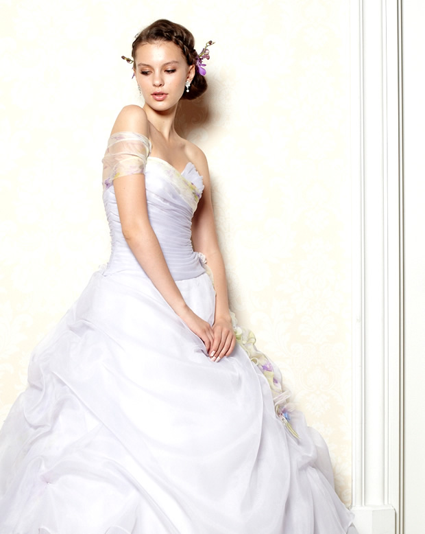
The moment you put on a wedding dress, you become the shining star. It's every woman's wish to have the perfect dress with an eternal shine for the day she takes her vow.


August 21, 2011

another edition 10th anniversary / fall and winter : art direction

anotheredition_fw001.jpg

anotheredition_fw002.jpg

anotheredition_fw003.jpg

.....

brand direction : michiko nagai ( UNITED ARROWS )
direction : paragraph
art direction : tomomichi ikeda ( ungraffi )
photography : UNITED ARROWS
licensing : keiko hidaka ( cross world connections )
model : Blythedoll ( USA CWC )

.....


April 20, 2011

ASPESI primavera / estate collezione 2011 : season book

aspesi_catalog001.jpg

aspesi_catalog002.jpg

aspesi_catalog004.jpg

aspesi_catalog005.jpg

aspesi_catalog007.jpg

ASPESI PRIMAVERA / ESTATE COLLEZIONE 2011
season book

.....

art direction / graphic design : tomomichi ikeda ( ungraffi )
creative direction : paragraph
photography : yoshiaki tsutsui ( tsutui photostudio )
styling : kumi saito ( signo ), tadamasa murakami
hair and make-up : meguro ( d-cord )
model ( donna ) : paul pavlovskaya ( agence press )
model ( uomo ) : julien chanca ( loop )
print : Abeizm co., ltd.

.....


March 10, 2011

ASPESI omotesando hills limited shop

aspesi_shop1.jpg

aspesi_novelty.jpg

ASPESI PRIMAVERA / ESTATE COLLEZIONE 2011
omotesando hills limited shop
2011.02.18 - 2011.07.18
DONNA and UOMO

......

brand direction : megumi terada, eriko nakamura ( ASPESI )
direction : paragraph
art direction / graphic design : tomomichi ikeda ( ungraffi )
photography : yoshiaki tsutsui ( tsutui photostudio )
account exective : noriko ebara, ritsuko nakamura (cosmo communications)

.....


February 22, 2011

another edition 10th anniversary : art direction

ae_photo002-.jpg

ae_photo001-.jpg

ae_photo003-.jpg

UNITED ARROWS
another edition 10th anniversary

art direction, photo direction

.....

brand direction : michiko nagai ( UNITED ARROWS )
creative direction : paragraph
art direction / photo direction : tomomichi ikeda ( ungraffi )
photography : yumi nakano ( A.K.A co., ltd. )
licensing : keiko hidaka ( cross world connections )
styling : mari koyama ( cross world connections )
model : Blythedoll ( USA CWC )

.....


February 16, 2011

ASPESI primavera / estate collezione 2011 : AD, photo direction

aspesi_photo005.jpg

aspesiphoto002.jpg

aspesi_photo006.jpg

aspesi_photo001.jpg


ASPESI PRIMAVERA / ESTATE COLLEZIONE 2011

.....

art direction / photo direction : tomomichi ikeda ( ungraffi )
photography : yoshiaki tsutsui ( tsutui photostudio )
creative direction : paragraph
styling : kumi saito ( signo ), tadamasa murakami
hair and make-up : meguro ( d-cord )
model ( donna ) : paul pavlovskaya ( agence press )
model ( uomo ) : julien chanca ( loop )

.....


November 9, 2010

A'ILOGUE™ VI : logo design

ailogue_logo1.gif

ailogue_logo2.gif

ailogue_logo3.gif

A'ILOGUE™ visual identity
logo design + conceptwork


........

parent organization : puneet talwer ( AYD Inc. NYC )
visual identity : tomomichi ikeda ( ungraffi )
art direction + graphic design : tomomichi ikeda ( ungraffi )
project management : miyuki takano ( a'ilogue )
logotype base : Perpetua SC
symbol name : - agile -
......

Firstly, as an origin of the company name, ay digital sets up its East Asian foothold neither in Soul, Korea,
nor in Shanghai, China, but in Tokyo, Japan. This may indicates that we want to emphasis on our high quality work unique to Japan as ay digital’s corporate brand image.
we want to express that this Japan based Tokyo office is a team with Japanese high quality.
Like Lexus for Toyota, Apple for Macintosh, SAS (Special Air Service) for British armed forces, there are many brands and organizations that are known independently for their best performance. This company name represents my wish that Tokyo office for ay digital inc. will be known as the best team in such meaning.

concept by tomomichi ikeda ( ungraffi )


November 7, 2010

A'ILOGUE™ VI : stationary

ailogue_stationary1.jpg

ailogue_stationary2.jpg

ailogue_stationary5.jpg

A'ILOGUE™ visual identity
stationary - envelope and file cover -

........

parent organization : puneet talwer ( AYD Inc. NYC )
visual identity : tomomichi ikeda ( ungraffi )
art direction + graphic design : tomomichi ikeda ( ungraffi )
print : STRT print
paper : Vent Nouveau white and tant select 100kg

......


November 2, 2010

A'ILOGUE™ VI : business card

ailogue_namecard1.jpg

ailogue_namecard2.jpg

A'ILOGUE™ visual identity
lbusiness card design

........

parent organization : puneet talwer ( AYD Inc. NYC )
visual identity : tomomichi ikeda ( ungraffi )
art direction + graphic design : tomomichi ikeda ( ungraffi )
print : graphic print
paper : Vent Nouveau white 230kg

......

About the logo symbol,
It symbolizes our new business development and is meant to be the identity for ailogue. It symbolizes Japanese history and elegance. Whole silhouette represent flame, head dragon, body lion and wolf tail.
This symbolizes the richness of our various values. It also means that the animal is kinetic, strong and well balanced.
The name of the symbol is “agile”.


November 1, 2010

seraku brandbrochure

seraku_brochure2.jpg

seraku_brochure3.jpg

seraku_brochure4.jpg

seraku co., ltd.
brandbrochure

........

artwork : tadashi ura ( gleamix )
art direction + graphic design : tomomichi ikeda ( ungraffi )
translation : jun nakamura ( four-eighty )
print : minet printing
paper : kirabiki white PL 180kg

......


May 19, 2010

NetWare™ VI : logodesign + information card

netwarelogo.gif

NetWare™ visual identity
logo design with information card

........

visual identity : tomomichi ikeda ( ungraffi )
art direction + graphic design : tomomichi ikeda ( ungraffi )
logotype base : SnvD
paper : coatwell paper
print : G print

......

NetWare Inc. Method

We always have a solution that will fit your particular needs.
The company can reduce its publishing costs by repurposing existing contents.
We habe top-class business support service and I support that business is promoted smoothly.

NetWare | www.netware.cc
5-30-7 Sendagaya Shibuya-ku Tokyo 151-0051 Japan

_

netware02.jpg

netware03.jpg

netware04.jpg


March 1, 2010

TOCCA NYC / JPN - artwork floral motif

tocca_texture2.jpg

tocca_texture3.jpg


TOCCA NYC / JPN - artwork floral motif
floral stitching artworks

brand direction : ritsuko tsutsumi ( TOCCA JPN / OW ), jun takahashi ( OW )
artwork floral motif : tomomichi ikeda ( ungraffi )

......


TOCCA NYC / JPN : texture design

tocca_texture1.gif


TOCCA NYC / JPN - texture design
background texture pattern

enormously lush and come into flower

brand direction : ritsuko tsutsumi ( TOCCA JPN / OW ), jun takahashi ( OW )
art direction + texture design : tomomichi ikeda ( ungraffi )
texture colour : pantone 317C , white blue

......


December 22, 2009

seraku information card [ DM ]

srk_dm01.jpg

srk_dm02.jpg

seraku co., ltd.
information card [ DM ]

........

artwork + concept : tadashi ura ( gleamix )
art direction + graphic design : tomomichi ikeda ( ungraffi )
translation : jun nakamura ( four-eighty )
print : GP
paper : specialities No.130 270kg
texture : pearlfinish

......


December 7, 2009

SUGAR™ VI : brand card

sugar_bc01.jpg

sugar_bc02.jpg

sugar_bc03.jpg

SUGAR™ visual identity
brand card

........

brand direction : mayuka sano ( SUGAR )
visual identity : tomomichi ikeda ( ungraffi )
art direction + graphic design : tomomichi ikeda ( ungraffi )
print : csm Inc
thanks , masanori aoki ( csm Inc )
paper : DM 450kg ( beaten silver )

......

logo design concept
The logo symbol symbolizes that is the company where sugar Co., Ltd. promotes [beauty] as shape; is done.
I expressed "unity" (balance) or "sense of stability" "trust" "universality" by making a feeling of total unification the square of the square and decided to be based on this. "," of the lower right becomes the a cute accent symbolizing the beauty of the woman. For example, there is difference in this the a cute accent between English and French, and the English as the sight thinks that French can feel a significant, sexy impression for making masculine vanity because I spell it, and a character sign enters. This as a symbol of the beauty on the left there "is a meaning of ideal the shape protects the beauty, and to improve".

I will design the logo symbol which is easy to have I am solid-looking and I am symbolic and recognize it wearing well in future when I aim at the wide development about the field of beauty not to lose a high class and a feeling of brand.


June 29, 2009

SUGAR™ VI : logo design

sugar_logo01.jpg

sugar_logo02.jpg

sugar_logo03.jpg

SUGAR™ visual identity
logo design + conceptwork

........

brand direction : mayuka sano ( SUGAR )
visual identity : tomomichi ikeda ( ungraffi )
art direction + graphic design : tomomichi ikeda ( ungraffi )
logotype base : Akzidenz Grotesk

......


SUGAR Co.Ltd.
business contents :
beauty business,
development and research of beauty product,
and more.


logo design concept
The logo symbol symbolizes that is the company where sugar Co., Ltd. promotes [beauty] as shape; is done.
I expressed "unity" (balance) or "sense of stability" "trust" "universality" by making a feeling of total unification the square of the square and decided to be based on this. "," of the lower right becomes the a cute accent symbolizing the beauty of the woman. For example, there is difference in this the a cute accent between English and French, and the English as the sight thinks that French can feel a significant, sexy impression for making masculine vanity because I spell it, and a character sign enters. This as a symbol of the beauty on the left there "is a meaning of ideal the の shape protects the beauty, and to improve".

I will design the logo symbol which is easy to have I am solid-looking and I am symbolic and recognize it wearing well in future when I aim at the wide development about the field of beauty not to lose a high class and a feeling of brand.


April 22, 2009

BeauCiel VI : namecard

beauciel_namecard01.jpg

beauciel_namecard02.jpg

beauciel_namecard03.jpg

BeauCiel visual identity
namecard

paper : specialities No.130 270kg
texture : pearlfinish

........

brand direction : yukiko ebihara ( BeauCiel )
visual identity : tomomichi ikeda ( ungraffi )
art direction + graphic design : tomomichi ikeda ( ungraffi )

......

BeauCiel Co., Ltd.

web : www.beau-c.com

_


April 20, 2009

BeauCiel VI : logo design

beauciel_logo01.jpg

beauciel_logo02.jpg

beauciel_logo03.jpg

BeauCiel visual identity
logo design + conceptwork

........

brand direction : yukiko ebihara ( BeauCiel )
visual identity : tomomichi ikeda ( ungraffi )
art direction + graphic design : tomomichi ikeda ( ungraffi )
logotype base : rotis serif regular

......

BeauCiel Co., Ltd.

yukiko ebihara

web : www.beau-c.com
contact : info@@beau-c.com

_


January 30, 2009

asanochiyuki VI : brand card

ac_namecard01.jpg

ac_namecard02.jpg

ac_namecard03.jpg

asanochiyuki visual identity
brandcard

surface fabrication : gold embossing [ treated paper ]
paper : kissyoushi 200kg

........

brand direction : chiyuki asano ( milleb Inc. )
visual identity : tomomichi ikeda ( ungraffi )
art direction + graphic design : tomomichi ikeda ( ungraffi )
printing : GP

.........

web : asanochiyuki.com


January 26, 2009

underplot VI : stationery

underplot_st01.jpg

underplot_st02.jpg

underplot_st03.jpg

underplot visual identity : stationery
namecard + envelope

namecard
paper : eravale 200kg
color : snow white

envelope
paper : cottonperl
color : snow white

........

brand direction : kenji imada ( underplot )
visual identity : tomomichi ikeda ( ungraffi )
art direction + graphic design : tomomichi ikeda ( ungraffi )
printing : graphic
envelope : hgrm envelope co.

......


January 15, 2009

underplot VI : logo design

underplot_logo01.gif

underplot_logo02.gif

underplot_logo03.gif

underplot visual identity
logo design + conceptwork

........

brand direction : kenji imada ( underplot )
visual identity : tomomichi ikeda ( ungraffi )
art direction + graphic design : tomomichi ikeda ( ungraffi )
logotype base : trebushet ms

......

underplot

kenji imada
interactive designer
koishigawa bunkyo-ku tokyo 112-0002 japan

web : underplot.jp
contact : imada@underplot.jp

_


January 13, 2009

newyearcard 2009

nycard2009_01.jpg

nycard2009_02.jpg

newyear card 2009

【 modern new year celebratios 】

visual : yellow sunshine
paper : kissyoushi 200kg

...

visualwork + graphic design : tomomichi ikeda
printing : graphic


December 9, 2008

asanochiyuki VI : dress woven labels

ac_name01.jpg

ac_name02.jpg

ac_name03.jpg

asanochiyuki - dress woven labels design

dressのネームタグができあがった。
世界極小。

これだけの繊細なスケールでの刺繍技術に感嘆。

週末はいよいよドレスモデルの撮影 at月島

........

dress woven labels

brand direction : chiyuki asano ( milleb Inc. )
brand identity : tomomichi ikeda ( ungraffi )
art direction + graphic design : tomomichi ikeda ( ungraffi )
name dialogue + printing : junichi abe, hideo shinofuji ( kobaori woven labels )

.........


November 4, 2008

dress brand asanochiyuki VI : logo design

ac_logo.gif


dress brand
asano chiyuki branding

brand direction : chiyuki asano ( milleb Inc. )
brand indentity + logo, graphic design : tomomichi ikeda

......

brand concept

it’s pretty recent when girls started to talk about them. the era’s come for the sexy, not the sweet & feminine.
hostesses, who put in on beauty and have the wit and manner, are now the trendsetters.

their news-conscious and curious manner to pursuit on beauty and social affair; that idyllic sexiness, or allurement,
at times attract general interest and develop to a trend. likewise,
brisk men gather around to their strong intellect and curious mind.
their job is not just a nightclub business anymore. high quality service is now in demand,
and their skills do match those first-rate concierge and service staff at major companies if not more.

_

chiyuki asano ( fashion designer )

after graduating ESMOD Paris,
she worked as a designer in paris
acquiring pattern techniques to emphasize the beauty of feminine bodylines.
she engaged in many brands and designs worldwide with her own brand
“J’espère” as well as sanei-international co., ltd.


October 23, 2008

ungraffi name card

ungraffi_namecard01.jpg

ungraffi name card

........

art direction + graphic design : tomomichi ikeda
paper : specialities no. 211
paper type : aluminum , matt finish


October 22, 2008

holidaypark project™ - logo design

hpp_logo.gif

holidaypark project™

......

holidaypark project : tomoya hara
style + logo design : tomomichi ikeda


_tomoya hara

technical director , developer

born in 1982
nationality : japan
hometown : tokyo
career : web design and interactive design ,
css programing , interactive development.

holidayparkproject since 2007.


October 21, 2008

holidaypark project™ name card

hpp_namecard01.jpg

holidaypark project™

......

holidaypark project : tomoya hara
logo design : tomomichi ikeda

name card _
art direction + graphic design : tomomichi ikeda


September 15, 2008

gadgetwear logo design

gadgetwear_logo.gif

_

artdirection + graphic design : tomomichi ikeda

.......

origin_

the term this means clothes with playful sense.
things of top class in all fields have high perfection levels and are elevated to the realm of art.
sophisticated and beautiful things have an exquisite harmony of elements they are composed of,
and captivate people hearts. Seemingly simple at a glance, they blend in well with nature and have their independent values.
waste-free, not excessively outstanding, giving forth powerful energy in peace.


May 30, 2008

HITSPAPER™ cover artwork

hitspaper_cover.jpg

HITSPAPER™
cover artwork june version
artwork by ungraffi

...

concept + artwork : tomomichi ikeda
special thanks : arata sasaki ( hitspaper™ )

...

about ungraffi in HITSPAPER™


December 14, 2007

kaou - art signature : graphicpaper

kaou_graphicpaper.jpg

kaou - art signature

....

art signature : tomomichi ikeda
concept + graphic design : tomomichi ikeda
print : grp

...

_kaou syoin : takada / sakakibara
_family temple : higashihonganji / shinsyu otani


December 6, 2007

kaou - art signature

kaou.gif

花押 【 kaou 】

art of calligraphy teacher : issen teramoto
art works : kaou-syoin of ikeda
art signature : tomomichi ikeda


...

beautiful silhouette shape alone is sufficient.


we call a sign / a mark used in substitution for a art signature.
originally signature gradually made a design a pattern the thing
which signed commonly made a signer and an another person clear,
and to distinguish own name, and the art signature which had special shape was born to a document.

there is the origin for Sousyo style of signature.
we call this So-Myou and a special figure says the thing which became
it with art signature so as not to be able to possibly consider stroke order of So-Myou, shape to be a normal letter.
the beginning signed with a printed style of writing Chinese characters in the name,
but it was it with the signature that I gradually destroyed for Sousyo style and extremely
called the figure thing which became it with art signature in it.


_kaou syoin : takada / sakakibara
_family temple : higashihonganji / shinsyu otani


花押(かおう/華押)とは、署名の代わりに使用される記号・符号をいう。
元々は、文書へ自らの名を普通に自署していたものが、署名者本人と他者とを明確に区別するため、
次第に自署が図案化・文様化していき、特殊な形状を持つ花押が生まれる。

起源は自署の草書体にあり、これを草名(そうみょう)とよび,草名の筆順,
形状がとうてい普通の文字とはみなしえないまでに特殊形様化したものを花押という。
初めは名を楷書体で自署したが、次第に草書体にくずした署名となり、
それを極端に形様化したものを花押と呼ぶ。

....


花押署印:池田氏所有(高田藩榊原家)
菩提寺:東本願寺新別院(真宗大谷派)


-【kaou】 japanese art signature


April 11, 2007

IPSA 20AC PID cover design

ipsa_cover1.jpg
ipsa_cover2.jpg

IPSA 20AC PID cover design

.............

art direction + graphic design : tomomichi ikeda
printing : ESS


January 9, 2007

image ability logo design

imabi_logo.gif

im-abi : image ability

.....

logo design : tomomichi ikeda


image ability firstly message :

firstly image ability is the installation file
which is for the purpose of expressing it as intuition as but
I felt it I do not take words as words, and to wear
because I take a theory as a theory.
we take good care of inspiration and sympathy
without lending an ear in a dull objection just arguments
without keeping a deep meaning for words.
when we understood a meaning of the thing,
I am rich, and we may grow big widely.


we are :

art direction + graphic design : tomomichi ikeda
motion development : kenji imada
creative direction : sanae uchinaka
[ now in Italy ]


copyright image ability + ungraffi all rights reserved.


July 3, 2006

qualix invitation

qualix_invitation03.gif

qualix invitation
realize the abundant potential inherent in each individual
.......
CI + graphic design : tomomichi ikeda
printing : kimei print
.......


July 2, 2006

qualix invitation card

qualix_invitation01.jpg
qualix_invitation02.jpg

qualix - invitation card
realize the abundant potential inherent in each individual
.......
CI + graphic design : tomomichi ikeda
printing : kimei print
.......


July 1, 2006

qualix logo design

qualix_logo.gif

qualix
realize the abundant potential inherent in each individual

.......
CI + logo design : tomomichi ikeda
.......

"qualix" is a design construction materials brand that improves quality of the space.

it aims at the thing that the dwelling space of Japan becomes rich
by improving the quality of the construction materials design in "qualix".
it ..building component that composes it.. jointly develops with the partner manufacturer
for the design quality improvement of an architectural space.
the product development to attempt the brand-making of everybody
and the differentiation of each project by development with the speed is entrusted.


April 5, 2006

ito- singular + plural | graphicpaper free

ito_graphicpaper.jpg

art works : tomomichi ikeda

One thing leads to another, and again leads to many more.
The many converges to one. What makes the person unique is
to feel the flow in various speed,
each different from one another. What converges to one is big.


January 10, 2006

japan social entrepreneur forum graphic

japan social entrepreneur forum graphic visual

jsef_graphic.jpg

jsef_graphic.jpg

.......
artdirection + graphic design : tomomichi ikeda
color concept : hiroshi tasaka , tomomichi ikeda
printing : hokutosha
.......

color : oregano green, dull green, brown + green, olive green


January 9, 2006

jsef brochure

japan social entrepreneur forum design

jsef_brochure.jpg

japan social entrepreneur forum graphic pamphlet
.......
client : japan social entrepreneur forum
CI + artdirection + graphic design : tomomichi ikeda
printing : hokutosha
.......


January 8, 2006

jsef logo design

jsef_logo.gif


japan social entrepreneur forum logo design

.......
client : japan social entrepreneur forum
concept + logo design : tomomichi ikeda
.......

jsef in the requiem symbol as for the character of J.
approval by person's will and power and they
It is assumed the one to mean development by a lot of entrepreneur actions and the
spirits. The curve shows the extension feeling of the plan expansion.


copyright ungraffi [ tomolog ] , all rights reserved.
web : www.ungraffi.org
contact : info@ungraffi.org
from jpn / england